We live in a visual culture. Some of the most successful social media platforms (ahem, Instagram) are built upon visuals alone, and studies have shown that content with visuals gets almost 2x as many views as content without. Visuals are clearly correlated with engagement, but it can be challenging to constantly produce new and interesting artwork. It takes time, resources, and planning — and, ideally, it would reflect your church's unique personality.
Luckily for you, we've created a step-by-step guide to help you create great artwork using free online tools. Sound good? Let's get started!
Overview
The image formula is as follows:
Background + Tint + Text = A Great Image
You may be wondering how to combine these elements, or how to create a tint. Don't worry — we will walk you through the whole process step-by-step below.
Step 1: Select a Background
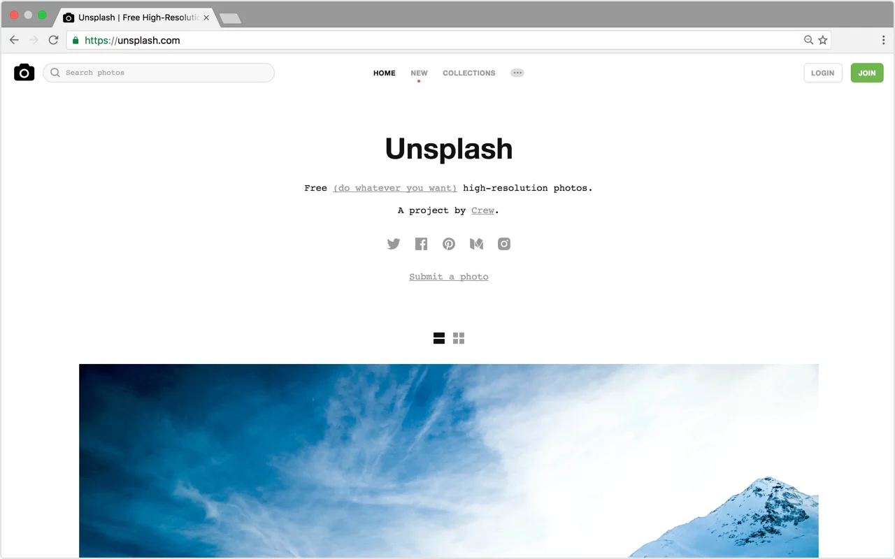
First, you’ll need a background. This can be a photo, a pattern, or a solid color. Unsplash, Pixabay, and Pexels are all great resources for free, high-quality images (although keep in mind that The Church App is in no way affiliated with these sites, and as such we have no control over the content contained in them). Not only that, but all of the images on these sites are 100% commercial-use friendly, meaning that you can modify and distribute them in any way you choose without worrying about infringing on a copyright license.
Step 2: Add a Tint
Once you’ve found a background that you like, the next step is to add a tint. Adding a tint is optional, but the benefit of a tint is that it will help any text placed on top of your background to be readable. For the following steps, we are going to use Canva.com, a free online tool that will allow you to add elements like tints and text to your background image.
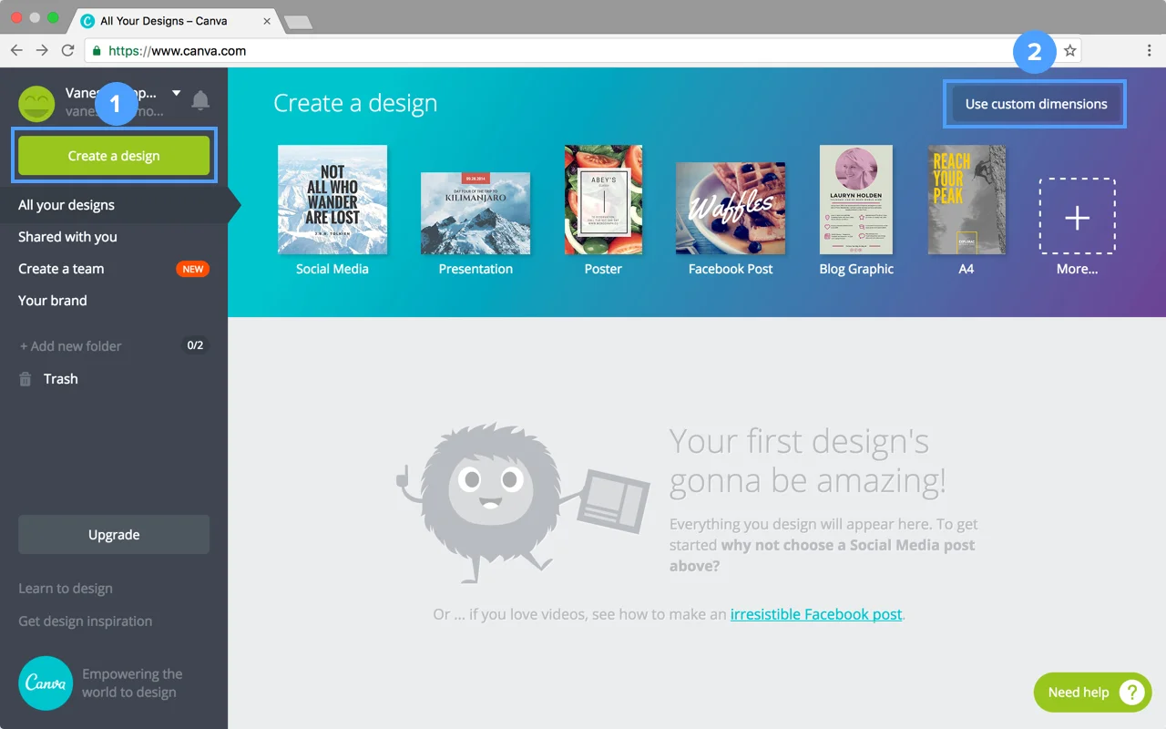
Once you create an account on Canva, click the Canva logo in the top left corner of your screen to start a new project. Then click “Create a Design” and “Use Custom Dimensions”.
Where your graphic will appear will determine the size you enter. 1920 x 1080 is the standard size for presentations and large displays, such as TV screens. If you'd like to promote your sermon on social media, check out this handy guide with all the sizes you'll need for every platform.
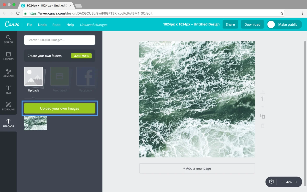
Drag your background image into Canva. Once it is uploaded, scale it to fill the whole background of your canvas.
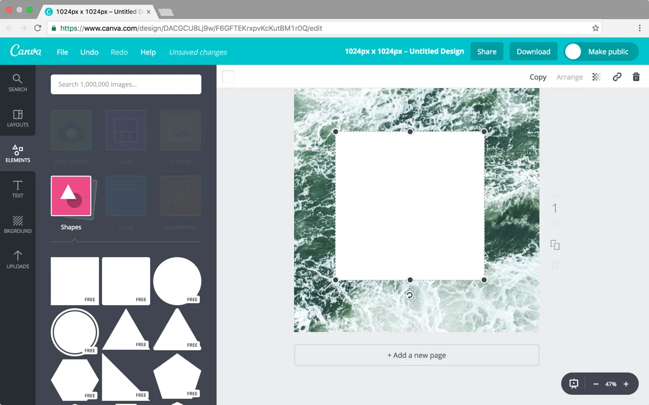
Next, add a tint on top of your background by selecting the “Elements” tab then “Shapes”. Drag the square shape on top of your background and scale it to fill the canvas.
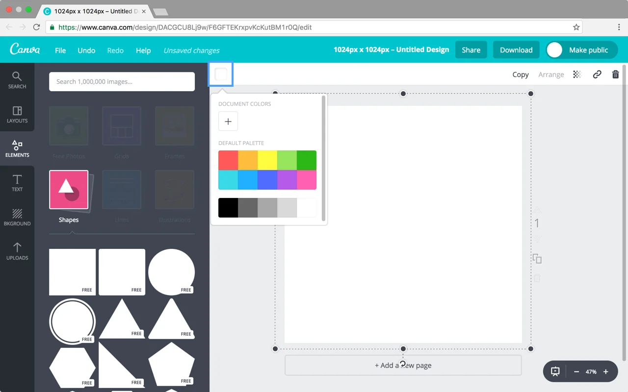
Click the white square in the upper left corner of your work area to change the color to black.
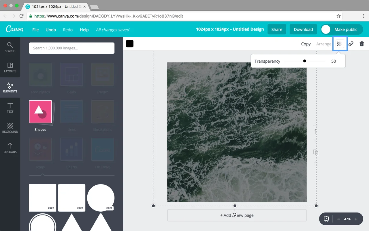
Next, adjust the transparency of that shape to create a tint. Click the checkered icon in the upper right corner of your work area and set the transparency to 50.
Voilà! Now we have a tint.
Step 3: Add Text
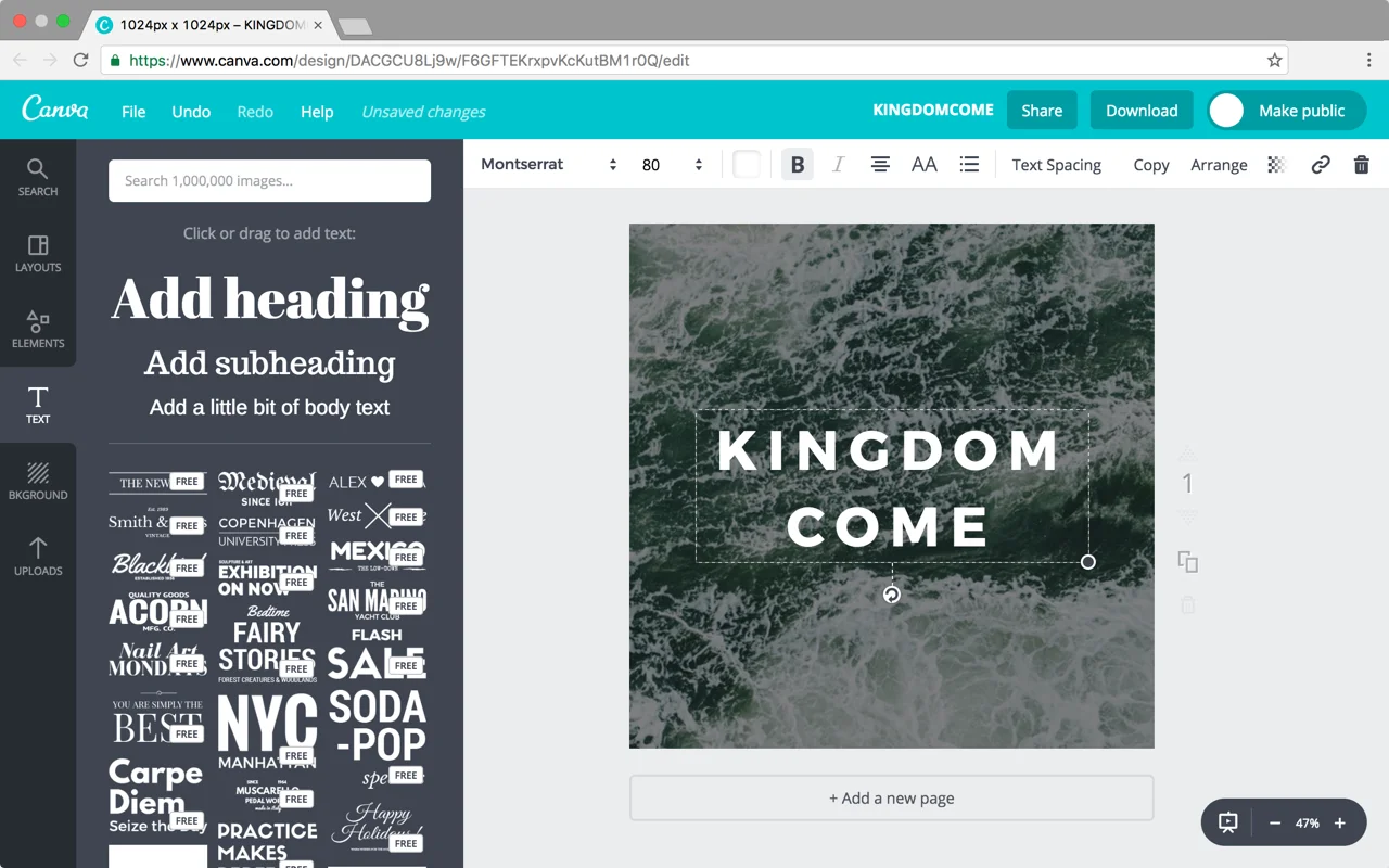
Lastly, add your text by selecting the “Text” tab and then dragging “Add Heading” onto your canvas. Feel free to adjust the size, color, and font of your text. White is always a good choice for a black tint, as it will stand out from the background.
If you’re not sure what font to pick, try using a simple font as they are timeless and easy to read. Here are some fonts we recommend that are available on Canva.com:
Aleo
Bodoni
Exo
Josefin Slab
Kollektif
Montserrat
Nixie One
Quattrocento
Source Serif Pro
Vollkorn
Feel free to experiment with using all uppercase letters or adjusting the letter spacing of your text. These small details can really make your image look polished.
Canva also provides templates that combine different text styles for you – try out your headline in a template and see how it looks!
Conclusion
That’s it! You’re well on your way to creating beautiful sermon artwork. If you found this tutorial helpful, please let us know by tweeting us some of your artwork @subsplash of using the hashtag #subsplashhints. We'd love to hear from you and see what you create!


